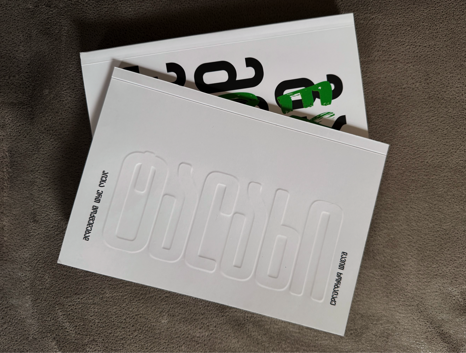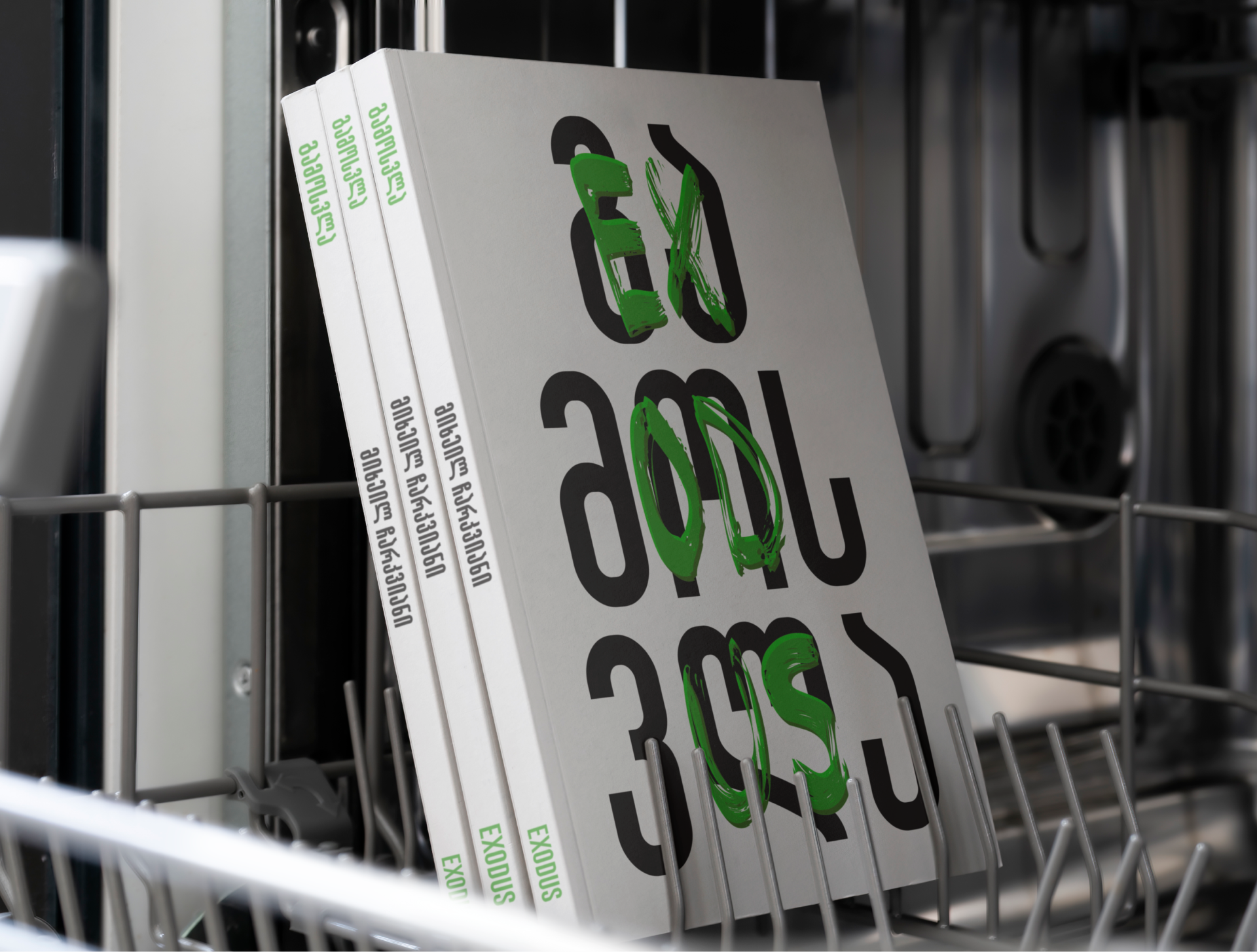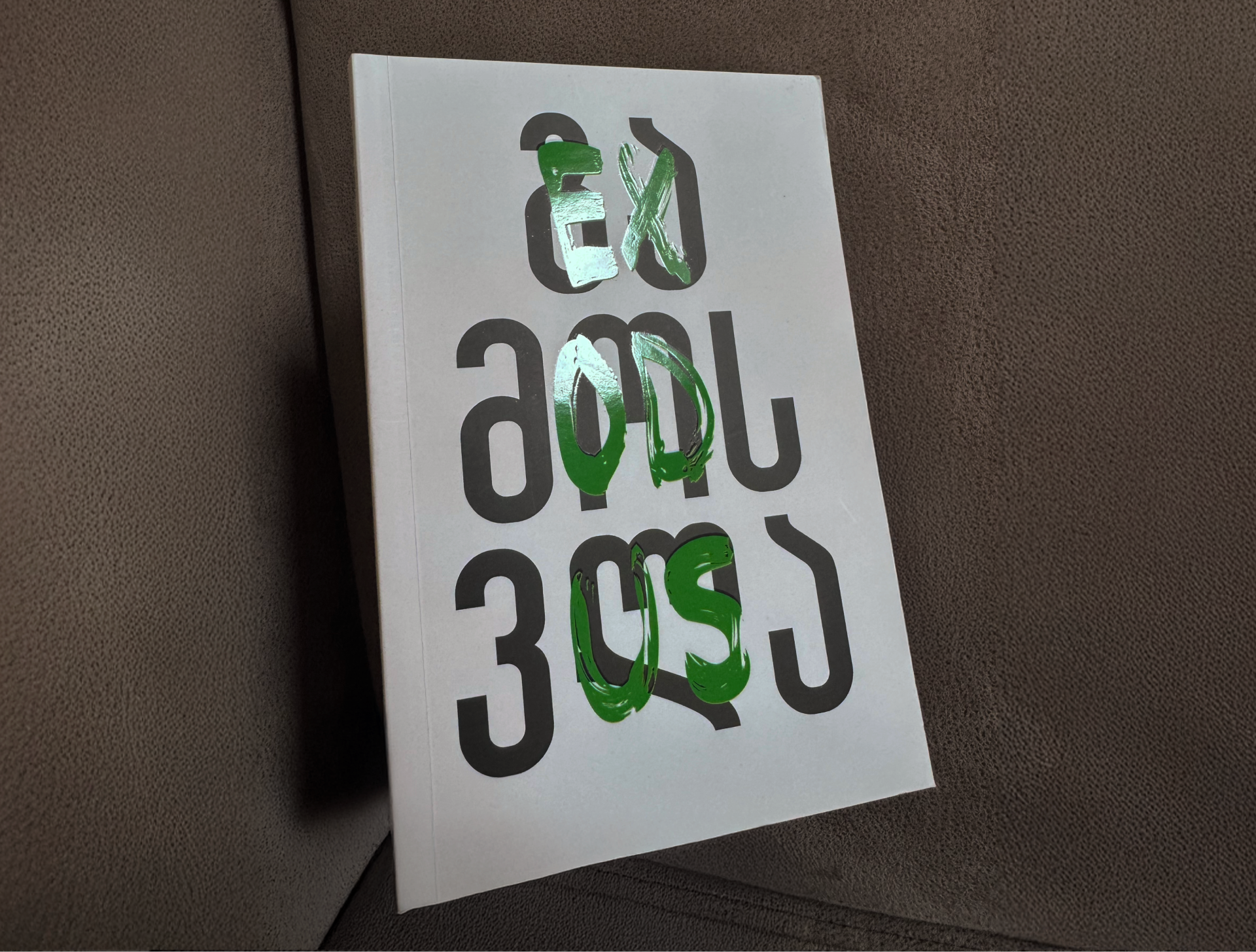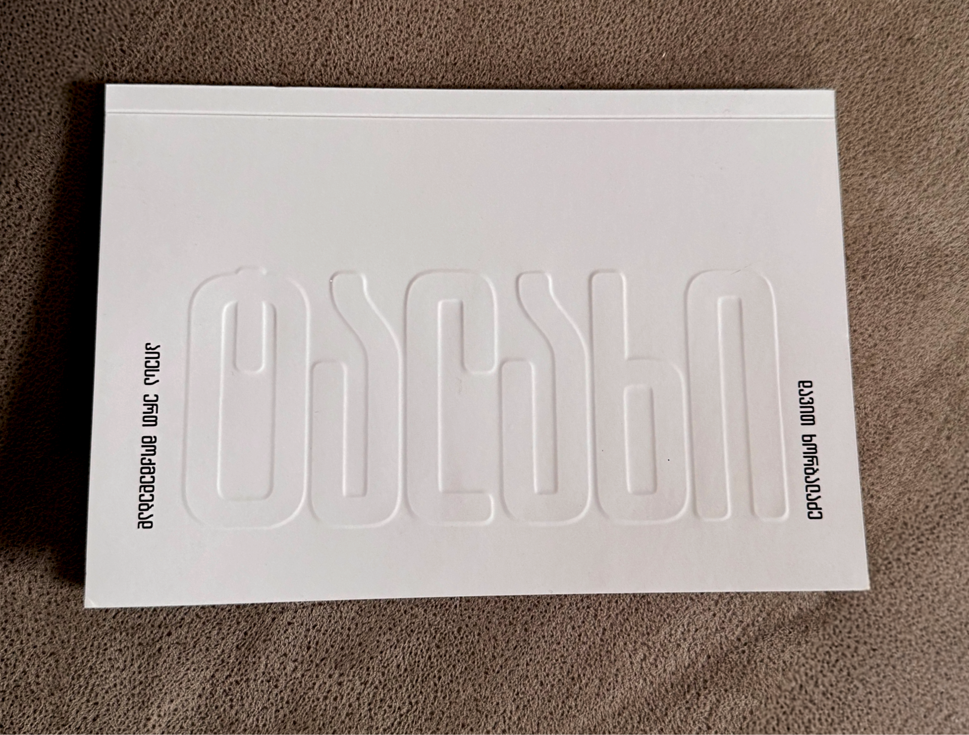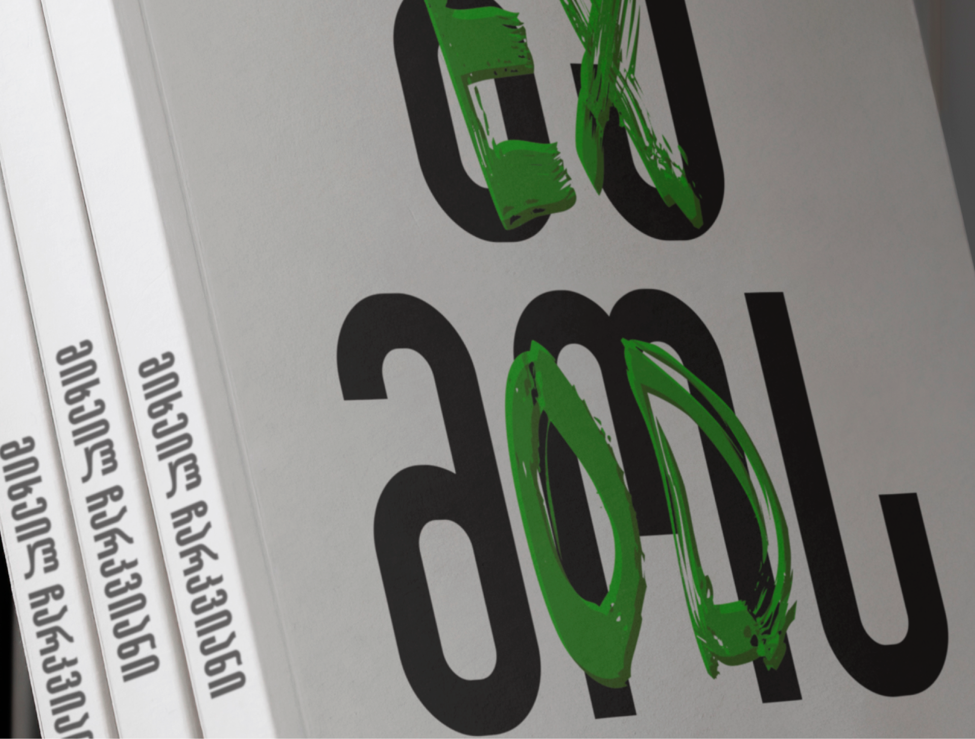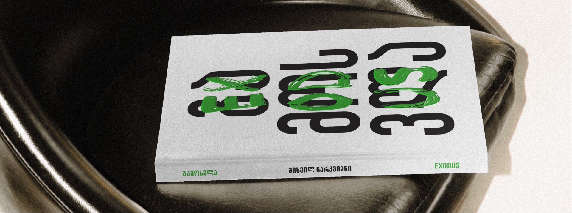
Exodus & Talakhi
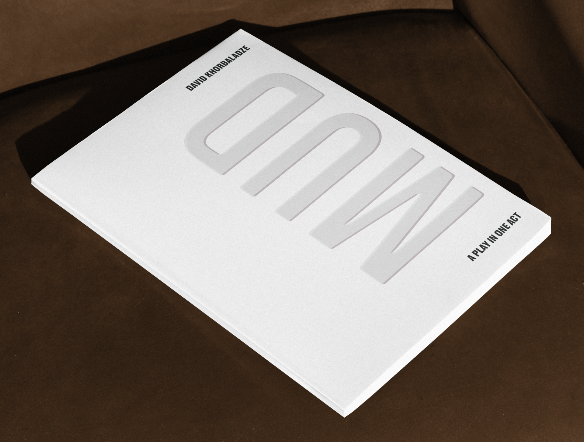
With this project, I wanted to think a bit outside the box and explore print beyond flat surfaces. For MUD, I experimented with blind embossing on white paper, the title is physically present but almost invisible at first glance. It invites touch before reading, making the material itself part of the narrative. In contrast, EXODUS introduces layered typography and dual-language titling. One language appears in a pop-color embossed finish, breaking the neutrality of the surface and adding a physical, almost raw gesture to the cover. The combination of clean structure and expressive texture reflects the conceptual duality within the book. Through these editions, I focused on pushing print beyond flat graphics, using embossing, layering, and contrast to create a sensory experience that can only exist in physical form.